Mobile First Indexing and best practices
What is mobile first indexing?
Mobile-first indexing is the practice of using the mobile version of web pages for indexing purposes. This means that Google, in the majority of cases ‘crawls and indexes pages with the smartphone agent’.
Google’s mobile first indexing was officially rolled out in 2019 and is now the default for all new websites. It is strongly recommended by Google to optimise your website for mobile first indexing, and you can check in Google Search Console if and when they switched to mobile-first indexing for your site.
Moz.com created this great diagram to explain how mobile first indexing works:
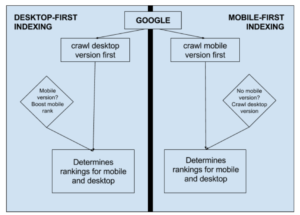
Image source: https://moz.com/blog/mobile-first-indexing-seo
One note to remember is that mobile-first doesn’t mean mobile-only. If you don’t have a mobile version of your site, Google will default to the desktop version. But as most websites nowadays exist for both desktop and mobile users, optimising for mobile first indexing shouldn’t really be overlooked if you want to perform well in the organic search results.
Here are some tips on how to make sure your website is optimised for Mobile First Indexing:
Make your content indexable
The first step to making sure site mobile-first ready is to ensure that the search engine bots and access and render your mobile page content and resources.
Make sure that you don’t have noindex or nofollow tags on your mobile pages – these stop Google from crawling and indexing those pages. Also ensure that you don’t have canonical tags on your mobile pages reverting back to the desktop versions, as this will also prevent Google from indexing your mobile pages. And finally, make sure you’re not blocking URLs with disallow directives, e.g. submitting robots.txt files that direct Google to block mobile versions of pages. A robot txt file is a great way to block a crawler from accessing certain parts of your website, so check that it’s implemented correctly and you’re not blocking Google from your mobile pages.
Make sure your content on mobile mirrors the content on desktop
Although you can have different designs on your mobile site compared to your desktop site, the amount of content should not be different. It would be unnatural to only show limited content on mobile whereas you could access more content on the desktop site. This would be unfair to users and Google wants to prioritise the user needs and experiences.
You should make sure that the content on your mobile site is equivalent to that on your desktop site. Most sites that are built with responsive design won’t have this issue as the content should be identical on both versions.
It’s not only your content that should be the same, but also the page titles, meta descriptions and the structured data. If you have structured data on your desktop site, make sure it’s also present on your mobile site and it’s the same. Data types that should definitely feature on both, according to Google, are “Breadcrumb, Product, andVideoObjectstructured data”.
As well as content, meta data and structured data, your image alt tags should also be the same across desktop and mobile. Use descriptive alt texts on all images to help the Google bots read your images and understand what they show.
Check the quality of your resources
It’s important that your images and videos on mobile are of a high quality. Images that are too small or too big, or have a low resolution will impact the user experience on mobile. You can find Google’s best practice on images here.
Make sure that your images and videos are also in the correct supported format – according to Google: “Google supports SVG format images, but our systems can’t index a .jpg image in the <image> tag inside an inline SVG” and “Videos are identified in the page by the presence of an HTML tag, for example: <video>, <embed>, or <object>”.
Check your Site Speed
Thanks to tools like the Lighthouse Developer’s tool or Google’s Page Speed Insights, you can easily check your site speed performance on both desktop and mobile. It’s common for desktop versions of websites to perform better for site speed as developers will have spent longer optimising for desktop. So your priority should be improving your site speed score for mobile. Easy fixes can include enabling image compression, minimising HTTP requests, measuring web server response times and avoiding redirects or redirect chains.
In conclusion, mobile first indexing is something you should be aware of, and making sure your mobile site is optimised should be a priority. This will benefit your rankings and your users’ experience, so it’s worth the effort in time. If you would like any support with this, you can reach out to one of our specialists today.